
You can do so much at Bravenet
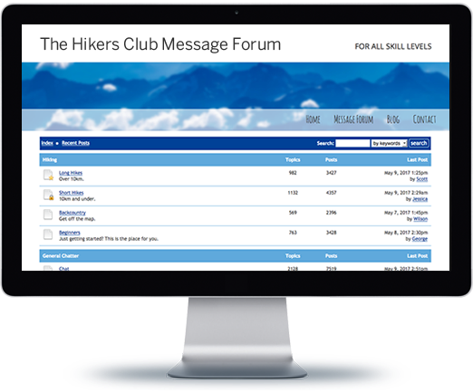
Message Boards
Forums allow you to easily
host online discussions
and build a community.
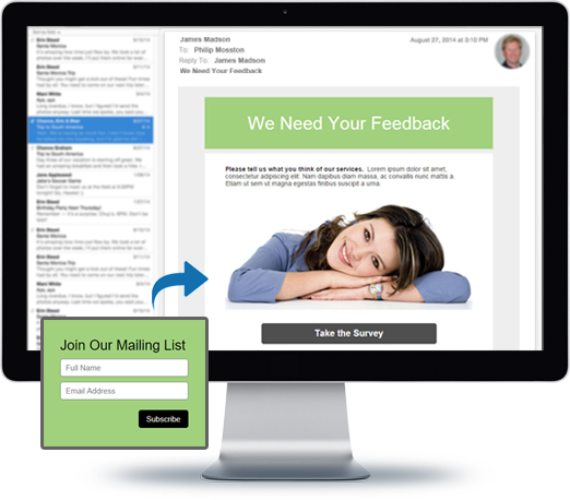
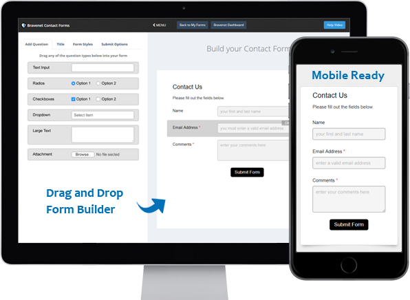
Contact Forms
Use the easy Form Builder,
collect information and
even attachments.
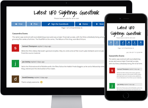
Guestbooks
Engage with your website
visitors by letting them post
in your Online Guestbook.
BraveShop Stores
Sell your products online,
embed store on your site,
Start earning today!
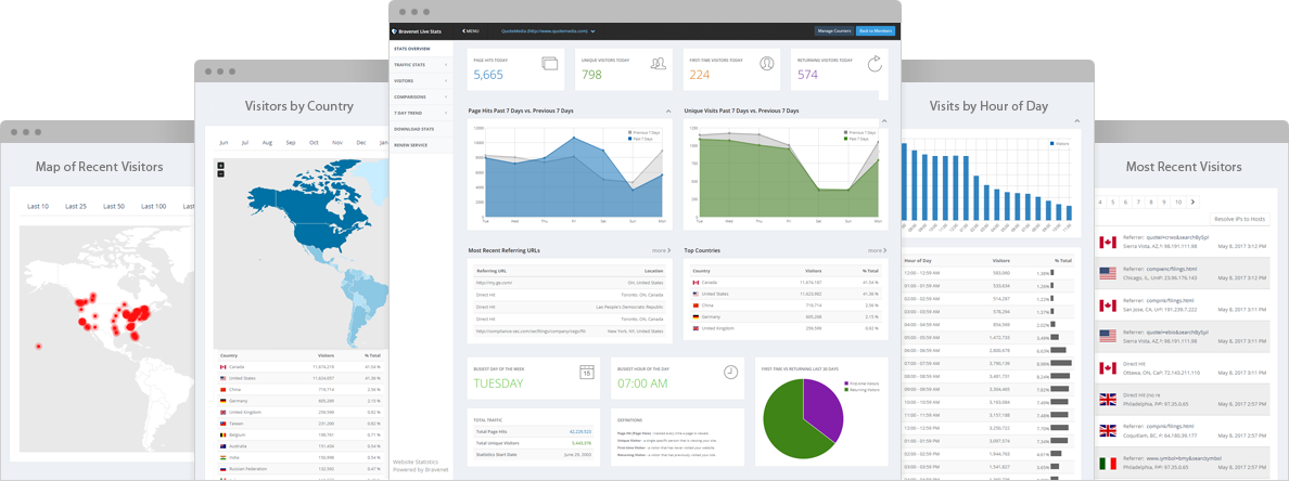
Counters & Web Stats
Watch your website traffic
with live site statistics
and historical graphs.
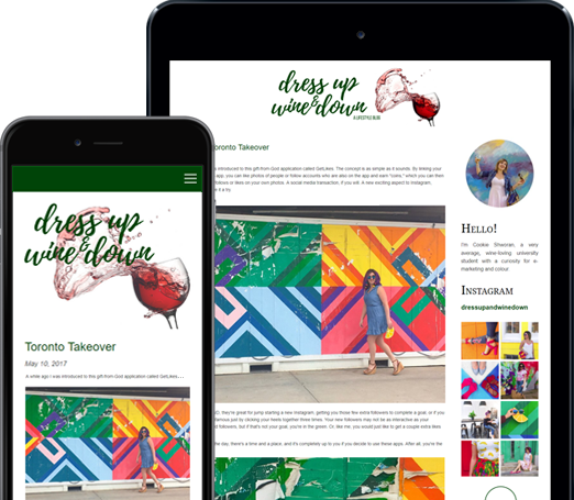
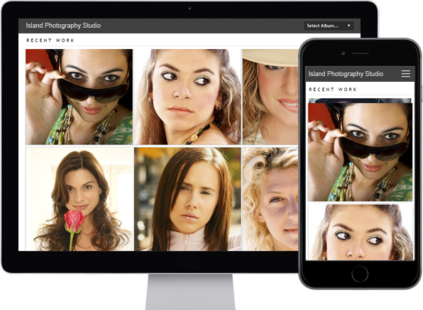
Photo Albums
Store and share your photos
online, private or public,
Enable public uploads!
Email Hosting
Feature-rich, reliable and
secure, with anti-spam and an
awesome email account manager.
Free Stock Photos
Bravenet Members enjoy
150,000 free stock photos
for use in sites & services.
- Services
- Web Hosting
- Site Builder
- Email Hosting
- Blogs
- Email Marketing
- Domains
- SSL Certificates
- Contact Forms
- Password Protect
- Photo Albums
- Guestbooks
- Message Forums
- Online Calendars
- Counters & Site Stats
- Online Stores
- Contact
- Support Center
- Webmail Access
- Advertisers
- Abuse
- X
- Company
- About Bravenet
- Corporate Web Design
- Marketing & SEO Services
- Sitemap
- Terms of Use
- Privacy Policy
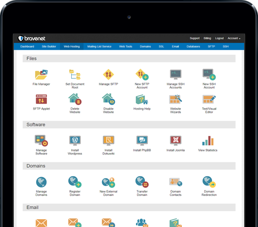
Bravenet is a leading webmaster services provider, providing website services to millions of users worldwide. Our user-friendly webmaster products make creating a creative web presence fun and easy.
From buying a domain and building a website, to adding interactive features like a message board, contact form, guestbook or poll, Bravenet provides all the web tools you need. Bravenet provides the promotion and marketing tools you need to establish a successful, high-quality, business or personal, internet presence.
© 2024 Bravenet Web Services Inc.

